My aunt's family business. Trading since 1980. Site on WordPress, maintained by an outside agency on a monthly retainer. The redesign was already paid for, sitting on a staging URL, never quite finished. Nobody owned the code.
The brief that emerged was unusual for a rebuild. Don't redesign anything. Don't change the URLs. Don't ask the family to learn a new admin tool. The brand works, the colour scheme works, the customers know the layout. What had to change was everything they couldn't see.
A returning customer shouldn’t notice
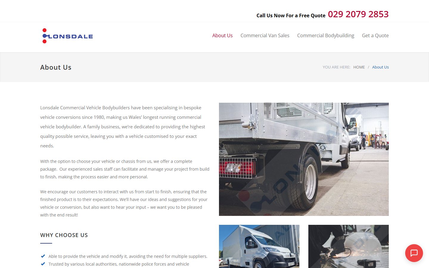
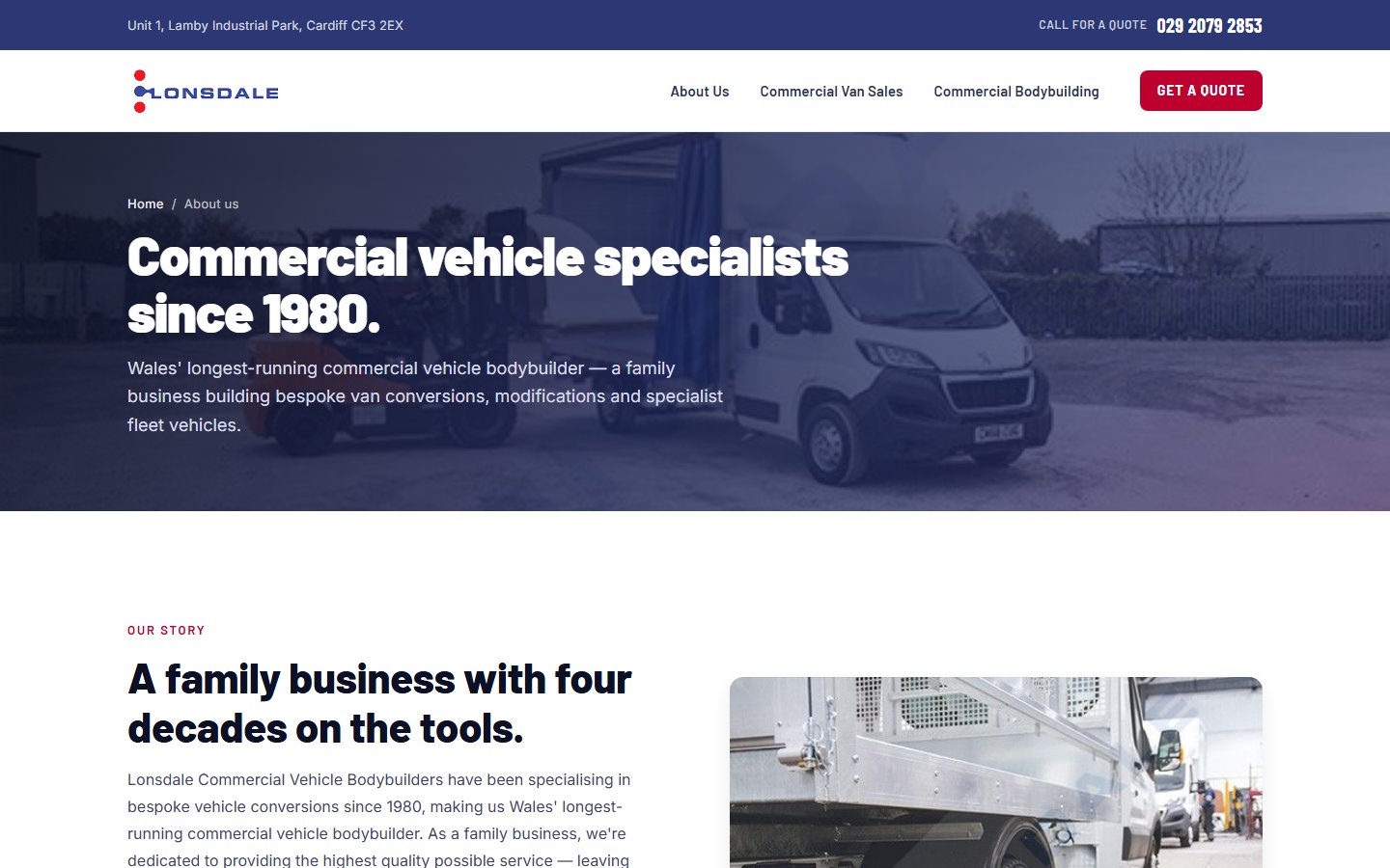
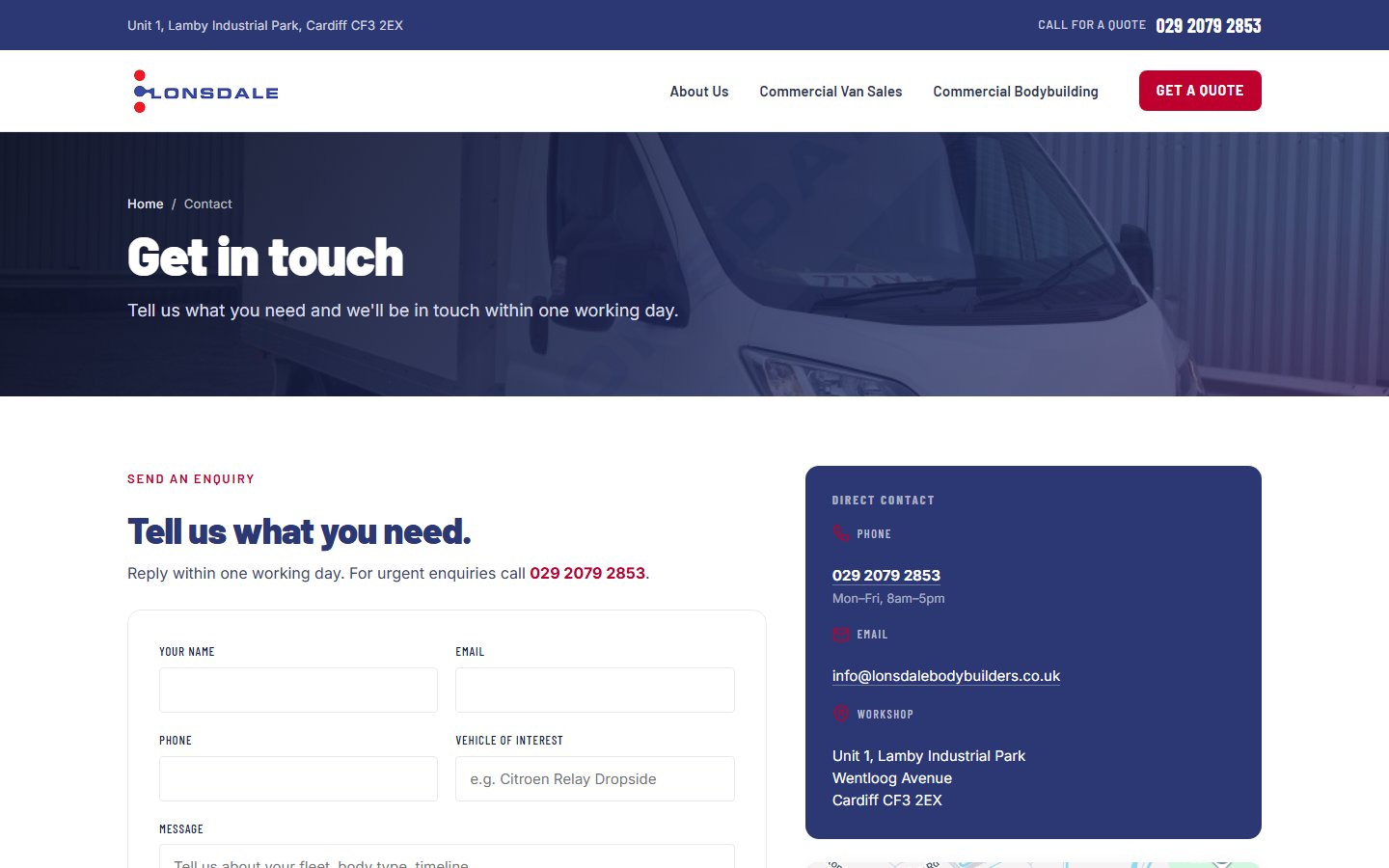
The cutover is done. The Astro build now serves the live domain, and the WordPress site it replaced has been retired. Each pair below is the same page — the old WordPress site on the left, captured before it came down, and the live Astro build on the right. Drag the handle. Same brand, same colours, same words. The bones never move — but page by page, the new build does the same job more sharply, and the real change, the one a customer can’t see, is underneath.
01Above the fold
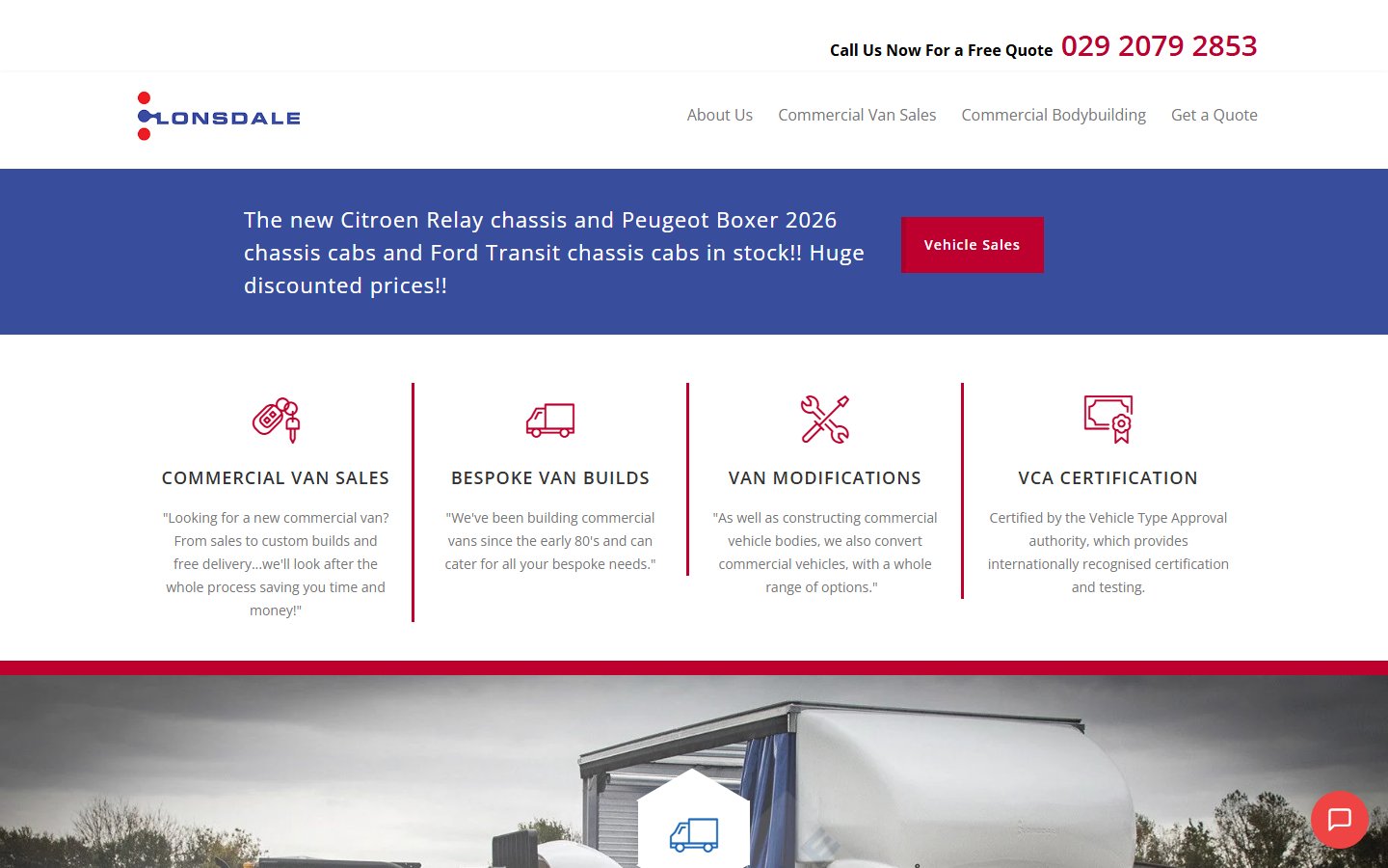
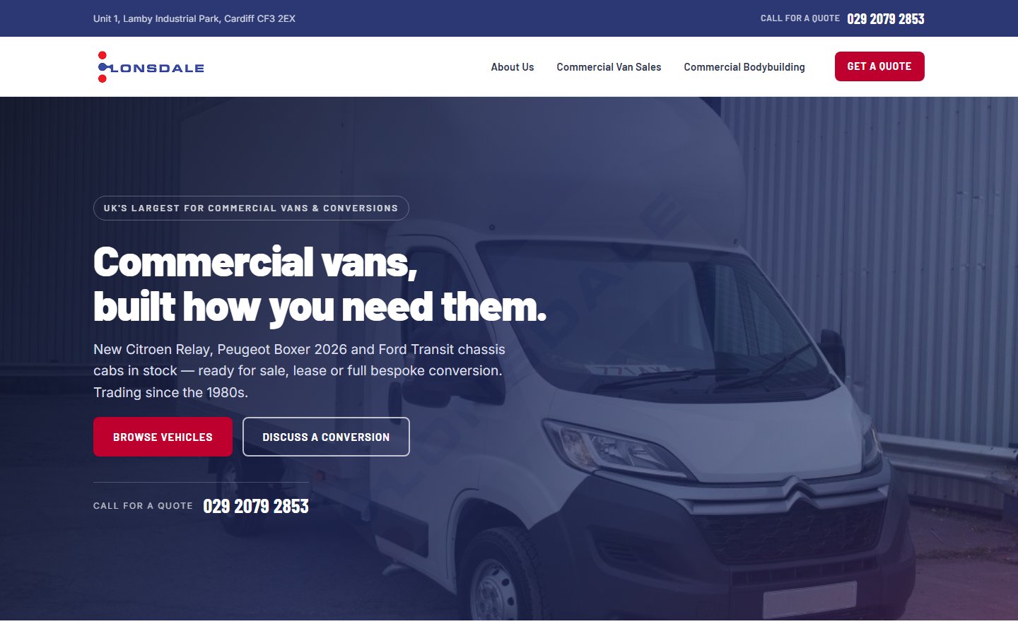
Homepage · captured May 2026
WordPress led with a stock photo of a tyre. Astro leads with a single van, a benefit-led headline and the year-models actually in stock.
 ← Before · WordPress
After · Astro →
⇄
← Before · WordPress
After · Astro →
⇄
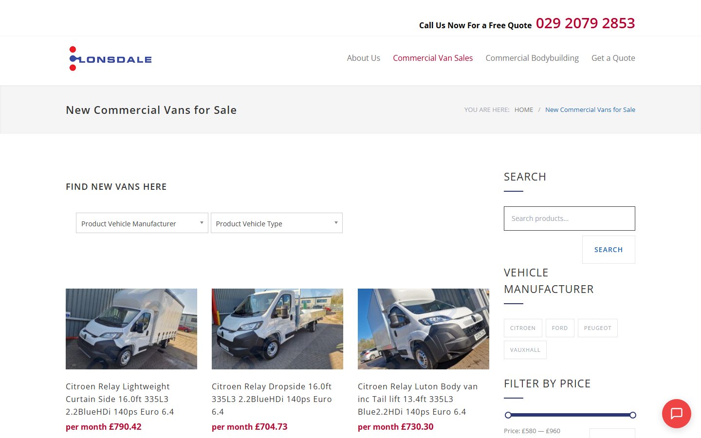
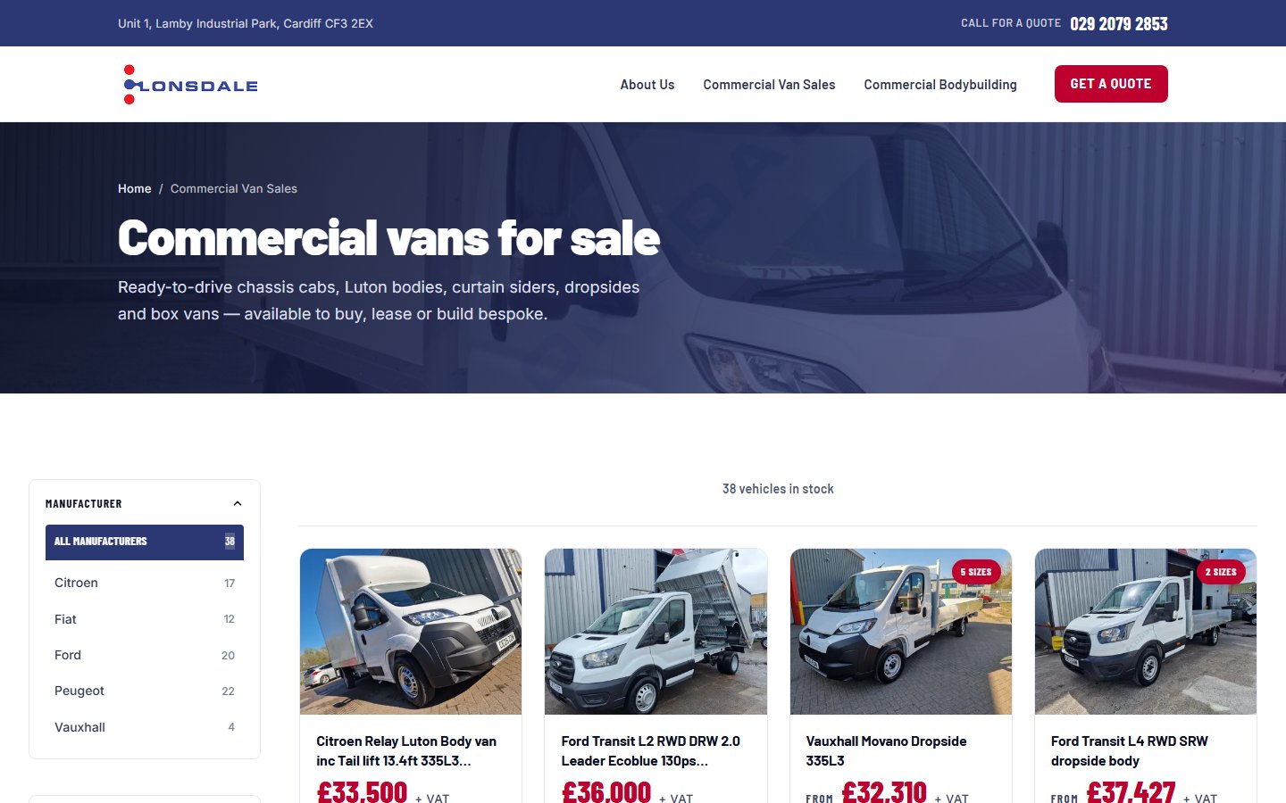
02The catalogue grid
/van-sales/ · same path, then & now
Three live facets on the Astro side — manufacturer, body type, body length — driven entirely by the data, no plugin. The catalogue is JSON in the repo, built ahead of time and cached at the edge.
 ← Before · WordPress
After · Astro →
⇄
← Before · WordPress
After · Astro →
⇄
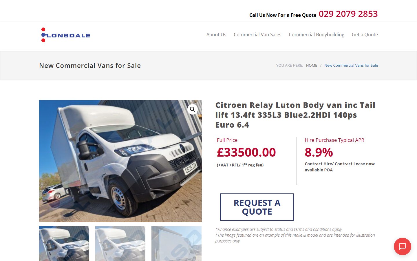
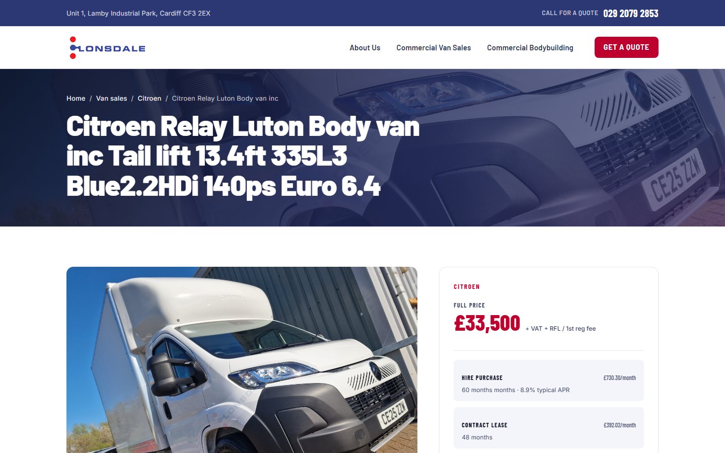
03Product detail
Single van · same vehicle
WordPress rendered a Visual-Composer accordion of plain text. Astro parses it once at build time into a three-column spec grid with a native variation picker beneath.
 ← Before · WordPress
After · Astro →
⇄
← Before · WordPress
After · Astro →
⇄
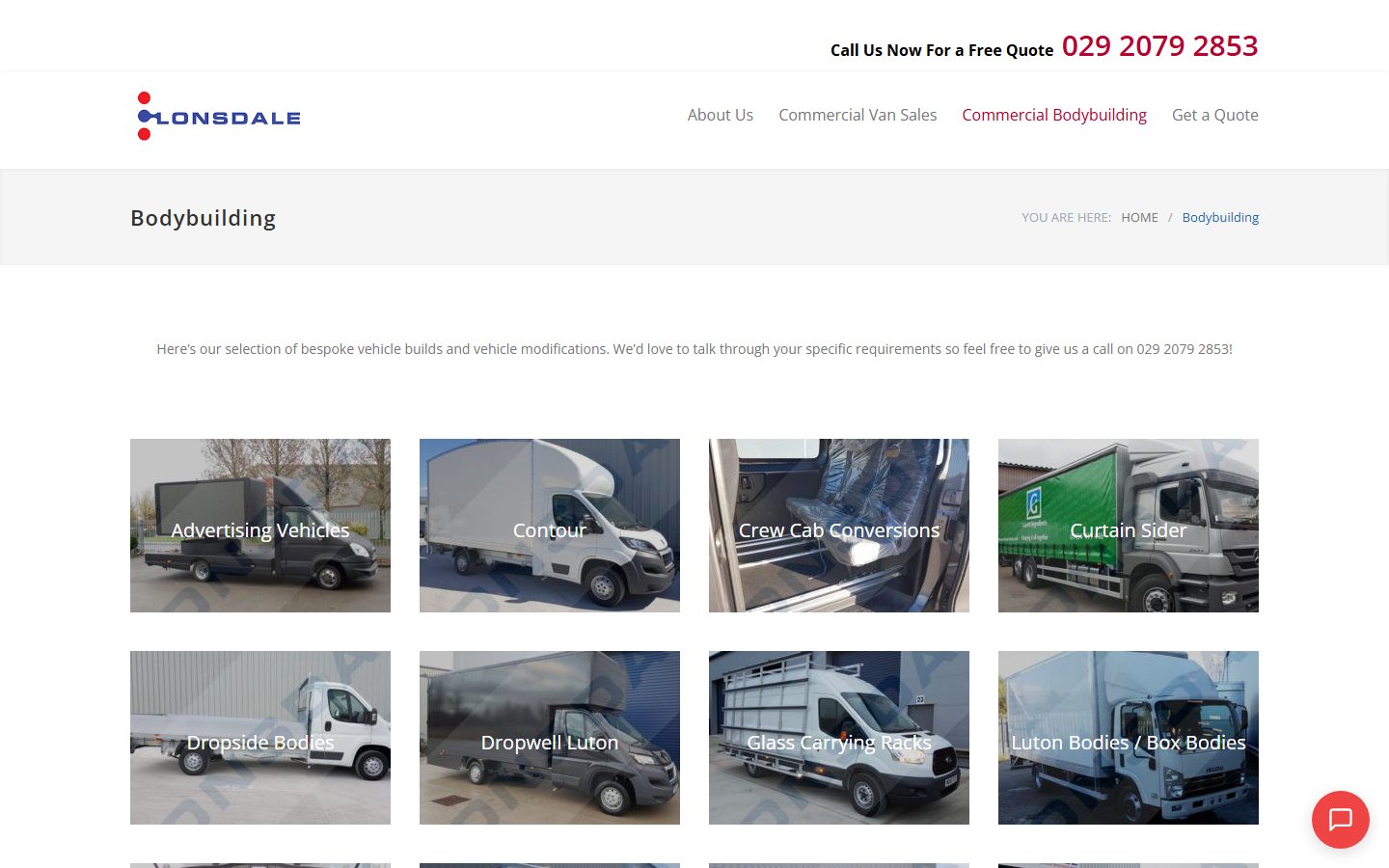
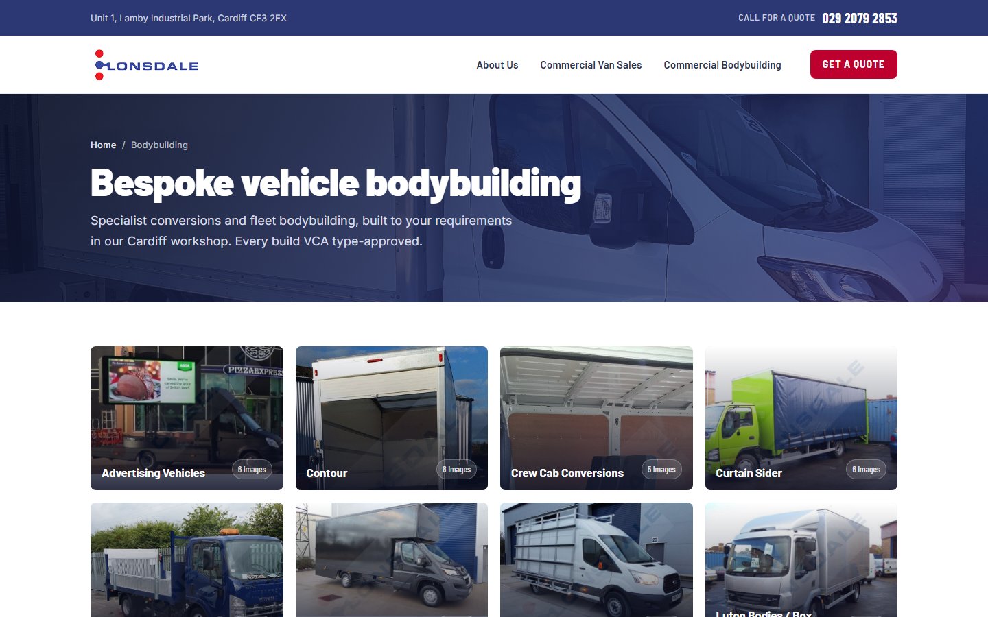
04Bespoke builds gallery
/bodybuilding/ · same path, then & now
Same imagery, redrawn as image-led overlay tiles in a 4:3 grid. 12 galleries, 501 source images, 1,400+ WebP variants generated by the build.
 ← Before · WordPress
After · Astro →
⇄
← Before · WordPress
After · Astro →
⇄
05The story page
/about-us/ → /about/
The WordPress page was a wall of paragraphs. The Astro version is a hero, a five-point “why us” set and a service split — same copy, paced.
 ← Before · WordPress
After · Astro →
⇄
← Before · WordPress
After · Astro →
⇄
06Get in touch
/contact-us/ · same path, then & now
Contact form on the left, address card and a live Google Maps embed on the right. The old version was a stretched one-column plugin form with no map at all.
 ← Before · WordPress
After · Astro →
⇄
← Before · WordPress
After · Astro →
⇄
The soft retouch
Not every rebuild is a tear down.
Most agency rebuilds start by asking the client to approve a new design. The customer learns a new layout. Backlinks break. Search rankings dip. Six months in, everyone is reminding each other why the rebuild was worth it.
A soft retouch is the opposite. The visual identity stays. The URLs stay. The customer can't tell a thing changed. Underneath, the engine gets replaced. Faster pages, fewer plugins to patch, source code under the family's own account, hosting bill cut to zero. The work shows up where it matters.
For most family businesses, the website is twenty years of accumulated work and trust. The mistake most rebuilds make is treating that as legacy to be replaced. The right move, more often than not, is to keep everything the customer sees and replace everything they don't.
The Lonsdale soft retouch is the pattern. The same approach now applies to Saddle Central, to several Cardiff and Bristol businesses on the agency pipeline, and to anyone whose site looks fine but feels slow.